04 May 2018
By portermathewsblog
via houzz.com.au
Which trends from the eighties are worth a second chance, and which ones should you forget about?
Thought 1980s interior trends were destined to stay in the past forever? You might be surprised to see how many of the interior fashions of that decade are popping up again in our homes now – albeit in very different ways.
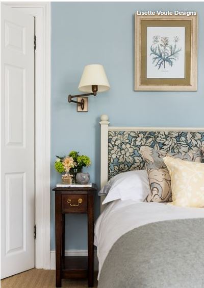 Ditch frills for refined florals
Pattern went to town in the 1980s, and in turn took city dwellers away to the countryside. No bed was complete without a pillow and bedspread adorned with florals – and of course a frilly edge and valance in an accent colour. Alas, the twee pastoral look was sadly chucked out with the chintz in the 1990s to make way for a plainer aesthetic.
But florals are back, and this time the look is more sophisticated. Take this gorgeous sleep space, for example. The pattern has been used sparingly on the bedhead and cushion, and tones with the plain surfaces elsewhere. The effect is pared back, elegant and a far cry from the Little House on the Prairie look of the ’80s.
Play with pastels
Nothing sums up the ’80s love of pastels more than the dapper outfits adorned by the stars of Miami Vice. Who can forget the lilac and pink t-shirts that Crocket and Tubbs wore under their laid-back cotton suits? And our homes were resplendent in pastel shades too – pale pinks, mauves, aquas, blues and yellows all vied for centre stage in 1980s interiors.
We’re loving pastels again, however, with aqua, peach and dusty pink seeing a recent revival. Contemporary pastels are muted and look great with soft shades of grey, while peach works well with copper accessories. The key is to choose just one pastel shade and tone it with more neutral hues, rather than going for an ’80s-style pastel extravaganza.

Go for a country kitchen – just not in orange
While 1980s florals aimed for a rustic ambience, so too did many of the decade’s kitchens. The farmhouse kitchen was a big look in the ’80s. Cook spaces packed out with wall-to-wall pine cabinets might look cosy, but the orange shade of wood could also put you off your microwave dinner.
We still love our country kitchens, but the look is completely different, mainly because of the paler, more stylish oak we opt for in favour of varnished pine. We can also experiment with other surfaces, mixing and matching for a more interesting look. The kitchen here has all the elements of a rustic design, but it has been given a twist. Wood is teamed with painted surfaces, while a concrete work surface adds an industrial edge.
Go for glass tables
In the decade that saw yuppies bustling around looking busy with their Filofaxes, there’s no wonder interiors often resembled a conference room. Glass tables were a perfect addition to this slick city look, but were ditched in favour of softer alternatives in the following decades.
They’re back though, but in more elegant, less business-like guise. The popularity of black-edged Crittall-style doors has inspired some dark-framed design elsewhere, like this gorgeous glass-topped coffee table. The look is industrial yet laid-back, and the glass adds a light, airy feel to the space.
Shape up with geometrics
If you wanted a cool, trendy bedroom in the ’80s a geometric design on your doona would do the trick. The bold creations of the Memphis Design movement, with its vivid colour palette and strong forms, prompted many copycat creations. Zigzags, triangles, stripes and hexagons were everywhere, and looked fab in both bold primary colours or bright pastels.
Geometrics are popping up all over the place right now, with accessories and textiles embracing the trend for bold shapes. But some of the most interesting ways to play with shapes at the moment are on walls and floors. The hexagonal tiles on this floor have a white corner, which creates an interesting, stunning pattern.
Colour up your bathroom suites
Not only did ’80s homeowners have to pick the colour of their bathroom walls and floors, they also had to worry about the shade of their bathroom suites. Baths, sinks and loos came in a range of delightful shades, including a high-tech two tone – yes, this really was a thing. If you’d decorated in the 1970s, your avocado suite was probably still going strong in the ’80s, but all traces of green were ripped out of bathrooms in the years that followed.
We’re not suggesting a revival of the all-over avocado bathroom suite (yet), but there has been a leaning toward green wash spaces lately. The shade usually appears on tiles and wall paint, but this beautiful bathroom shows how a lick of avocado on the underside of period-style baths and sinks can look simply delicious.
Get creative with cork
Cork made it big in 1970s interiors, and continued its glory days right into the 1980s. Kitchen floors and walls were covered with this tactile material, and kids’ bedroom walls were lined with cork tiles that worked as vast pinboards for homework and Duran Duran posters.
This brilliantly versatile material has made a welcome comeback and is being used for all sorts of interior surfaces, from tabletops to pot lids. The cork flooring in this kitchen is a great choice as it’s soft underfoot, great for insulation and easy to maintain.
See green with indoor plants
In an era where more was more, house plants were a great way to add that extra touch. Greenery was everywhere, popping up in bathrooms, jazzing up living room window sills and bringing the outdoors into glass conservatories.
House plants are breathing fresh air into our homes once again, which can only be good news. They not only warm up the space, but they make the air healthier, too – a win-win.
Frame your walls
A 1980s wall was never really complete without a wallpaper border. Wall coverings came with a matching frieze, so it was easy to add a complementary edging to your wallpaper design. Things have changed and now walls are more likely to fade into the edge, with some designers even choosing the same shade for ceilings, walls and joinery to merge the whole thing together.
Frames aren’t lost forever, however, as designers are getting creative with skirting boards. Paint them in a contrasting colour to the walls, or even choose one of the new patterned boards on the market, to give your room a sharp, defined border.
Leave it in the ’80s: bathroom carpets
Take a look at this beautiful bathroom space. Would you put a carpet on that floor? In the ’80s they would have, and maybe a fluffy floor mat around the loo as well.
With the vast array of floor surfaces available now, there’s no need to put fabric underfoot in your bathroom. The rustic look on the floor of this room has been created with wood-effect tiles, which give the same warm look as wood, but are much more resistant to water.
Tell us
Which of these 1980s looks are you happy to revive? Share in the Comments section. And if you enjoyed this story, like it, save it, save the photos and share your thoughts below. Join the conversation.
Comments (0)
04 May 2018
By portermathewsblog
via popsugar.com.au
 Image Source: A Beautiful Mess
When it comes to astrology, let’s admit it: who doesn’t love reading their monthly horoscope? Gaining insight into your future relating to your career, relationships, health, and beyond is not only intriguing and exciting, but often, it can be extremely accurate. So, when we heard about a mashup that existed between astrology, design, and colour theory, we had to know more.
This hybrid idealism, coined “colourstrology” by astrologist and numerologist Michele Bernhardt, is thoroughly mapped out in her book Colourstrology: What Your Birthday Colour Says About You. Michele has created a comprehensive chart of Pantone colours that are assigned to every single day of the year as well as one colour for each month. Using ruling planets, sun signs, and the influence of numbers and other important dates, Michele has determined which colour creates the highest benefit for each.
So locate your birthday month ahead, and read on as we break down your most beneficial colour as well as exciting ways you can incorporate it into your home space for an extra boost of positive energy.
January: Caramel
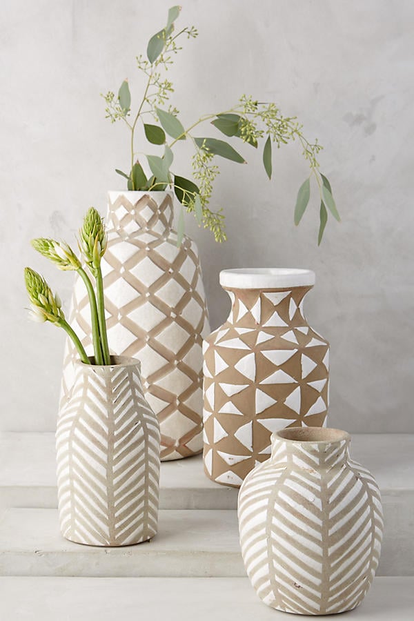
Image Source: Anthropologie
Hues of caramel can connect you back to the earth and keep you centered and focused. If you are a January baby, try investing in some terra cotta planters and arrange them on your patio or near your windowsill for the ultimate energy boost. Plus, the dark brown colour of the plant soil will also add to the effect.
February: Sheer Lilac
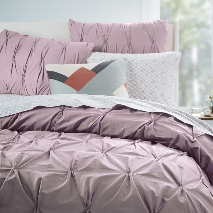 Image Source: West Elm
Sheer lilac can improve friendships and cast a vibe of kindness across you and any of your home visitors. Using lilac-coloured mugs and tableware can be the perfect way to receive the benefits of this colour while you enjoy tea or a meal among pals.
March: Fair Aqua
 Image Source: A Beautiful Mess
Fair aqua can increase relaxation and encourage meditation, so it is just the right colour to include in your bedroom design scheme. Choose a bedding set with bursts of aqua, or try to find a solid aqua blanket that can come in handy both at bedtime or for any lazy Sunday naps out on the couch.
April: Cayenne
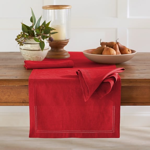
Image Source: Williams-Sonoma
Cayenne is a bright and intense colour, so be sure to implement it in a space that definitely requires a burst of vitality. If you have a home gym, try painting one wall this bold colour, or add a vibrant table runner to your kitchen nook for an extra pick-me-up in the mornings while you eat breakfast.
May: Bud Green
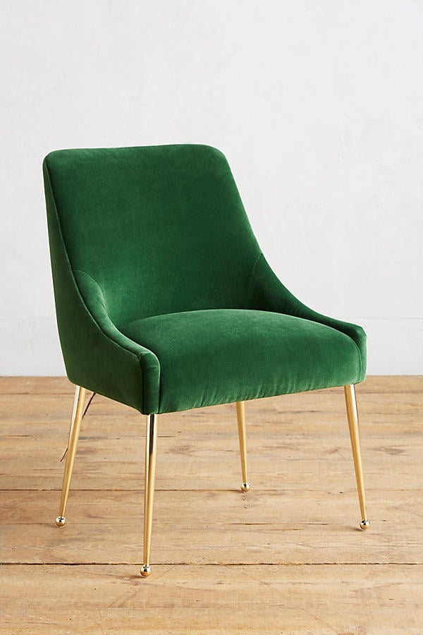
Image Source: Anthropologie
The colour bud green is closely linked to prosperity and success, so if this is your birth colour, be sure to incorporate it into your home office or desk space. Try including a green upholstered side chair to maximise this colour’s benefits or, if you’re cramped with space, a sleek green laptop cover or mouse pad will do just fine.
June: Aspen Gold
 Image Source: Designer Living
Aspen gold can promote successful communication, so think about which room in your home receives the most conversational activity. Painting the walls of your dining room a nice golden colour could be a good touch, or hanging art with bold yellow features is another way to get the most of June’s assigned colour.
July: Coral Blush
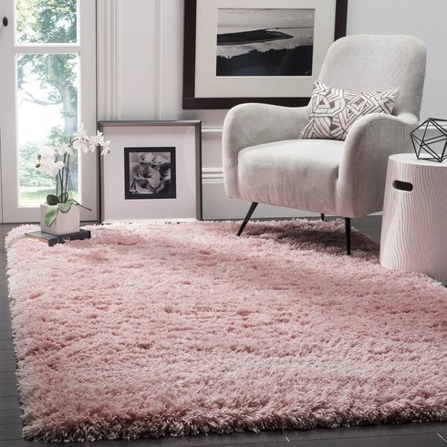
Image Source: Wayfair
July’s coral blush colour is extremely calming and promotes love and sensitivity, so adding this colour into areas of your home that you closely share with a partner is key. An area rug in a gorgeous blush hue placed in either your living room or bedroom is a genius way to infuse this colour into your space.
August: Sun Orange
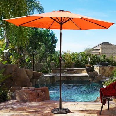
Image Source: Wayfair
A happy, bright sun orange is the best way to promote playfulness and fun, so recreational areas in your home are the best place to feature this colour. Placing a bold orange umbrella out on your patio will not only liven up your space, but it will definitely encourage lots and lots of outdoor Summer fun.
September: Baja Blue
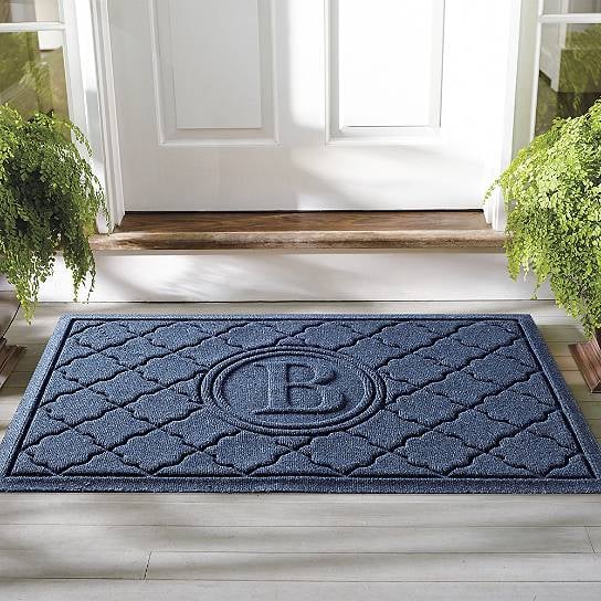
Image Source: Grandin Road
The distinct baja blue is synonymous with both beauty and attractiveness and is an amazing color to feature right in your entryway. Grab a welcome mat in this hue, or hang a framed print duo near the door to gracefully (and charmingly) welcome your guests.
October: Cerulean
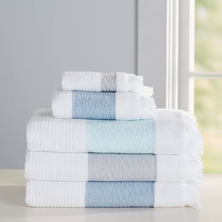 Image Source: PB Teen
Cerulean is another colour heavily linked to relaxation and tranquility, so it is an ideal choice for your master bathroom. Whether you decide to paint the walls in this shade or find a towel set in a similar hue, you are sure to enjoy the calming benefits.
November: Claret Red
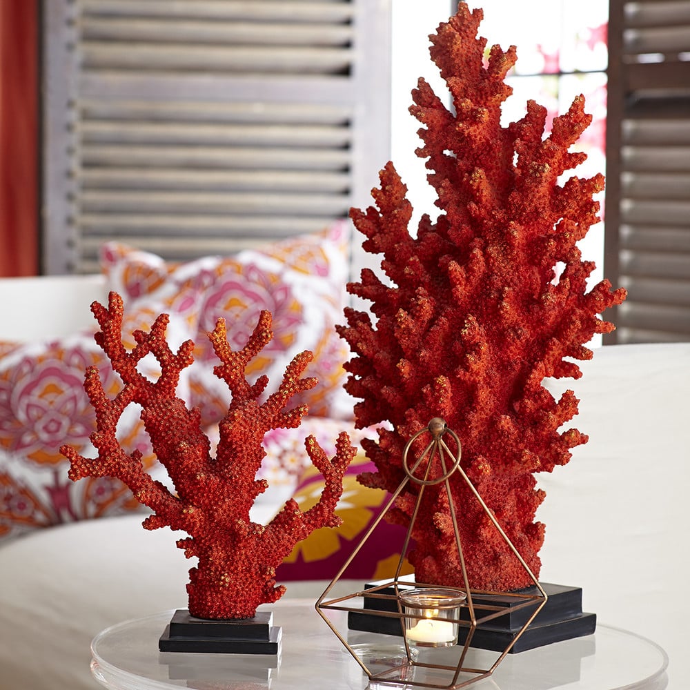 Image Source: Wisteria
This deep claret red is strongly linked to the libido and nurtures physical connection, so incorporating it into your bedroom space can do wonders for you and your partner. And since this colour is quite bold, focus on finding some smaller claret red accents, like a ring tray or small sculpture, to place on top of your nightstand or nearby dresser.
December: Pagoda Blue
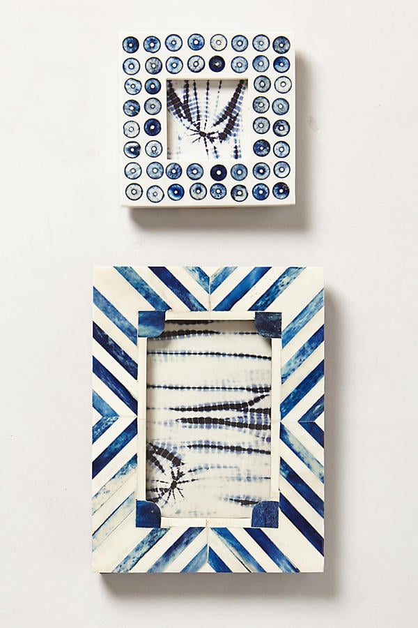
Image Source: Anthropologie
Pagodea blue symbolises vision, wisdom, and travels, so it is the perfect colour to feature in a bookcase display or wall collage to promote interest and vision. Try locating blue bookends or decorative coffee table books with bold blue accents or even a hanging picture frame with blue rims for an extra dose of imagination in these spaces.
Loving colourstrology? If you are interested in finding out today’s specific colour, just click here!
Comments (0)
13 July 2017
By portermathewsblog
via domain.com.au
Any painter knows good groundwork and the right equipment are the secret to successful paint jobs. After filling, sanding and cleaning, pause before flipping open a fresh can of paint and loading up a brush or roller. What you use to apply that gorgeous new colour makes the difference between a first-rate finish and one that screams bad DIY.
Take these tips for brushing up on your painting know-how.
Start squeaky clean
Using brushes with stiff, shaggy-dog bristles clogged with remnants of a previous colour, rather than buying a new tool for the job, is a false economy. Clean them up before you start, or invest in new brushes.
Resurrect synthetic brushes caked with water-based paint by soaking in very hot water with a little detergent. Rinse well, reshape by hand, wrap bristles in kitchen paper and hang to dry. Follow clean-up directions for brushes previously used with oil-based paints. Brush combs for removing paint residue and realigning bristles are sold at paint stores.

Photo by Paint & Brush – Search nightstands
Size up the job
Are you tackling a bedroom wall, a narrow trim, an entire room, or just touching up a shabby cabinet? Let the area to be painted guide you to the best brush width.
- Narrow frames and mouldings: 25-38 millimetres
- Doors, railings, cabinets, gutters, eaves: 50-63 millimetres
- Floorboards, skirtings, fascias: 75 millimetres
- Large, flat areas such as walls: 100+ millimetres, usually called “wall” brushes.
Tip: If you’re new to painting or have small hands, an 88-100 millimetre brush on a large wall may tire your wrist and arm. Go for a brush around 75 millimetres.
Pick a bristle
DIYers often ask whether natural or synthetic bristles work best:
Natural bristle brushes, mostly hog, ox or badger, are typically more expensive than synthetic ones and are used for oil-based paints, varnishes and shellacs. Don’t use for water-based (latex) paints, as they absorb water from the paint, softening and changing shape. This also affects the composition of the paint and may cause “tramlines”.
Comments (0)
14 June 2017
By portermathewsblog
You’ve got your bedroom looking cosy and the kitchen has been overhauled. Now it’s time to turn your attention to the living room. Luckily, the lounge is one of the easiest rooms in the house to redecorate: a lick of paint, a new sofa (or cover) and some cleverly chosen ornaments, throws, and cushions are often all you need. The following rooms cover all styles, from minimal Scandinavian-inspired design to upcycled boho, and will inspire your next living room revamp. It’s time to start hoarding paint samples!
1 Palm Tree Accents
2 Pastel and Wicker
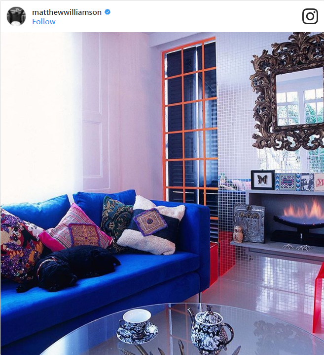
3 Moody Blue
4 Teal Touches

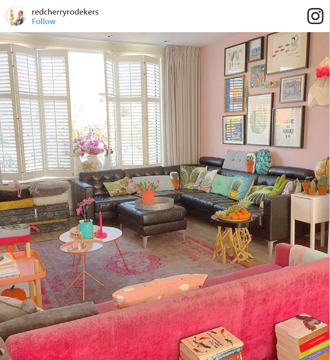
5 Cherry Pop

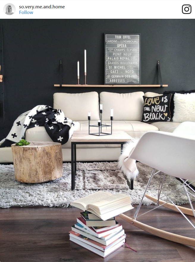
6 Cosy and Chic
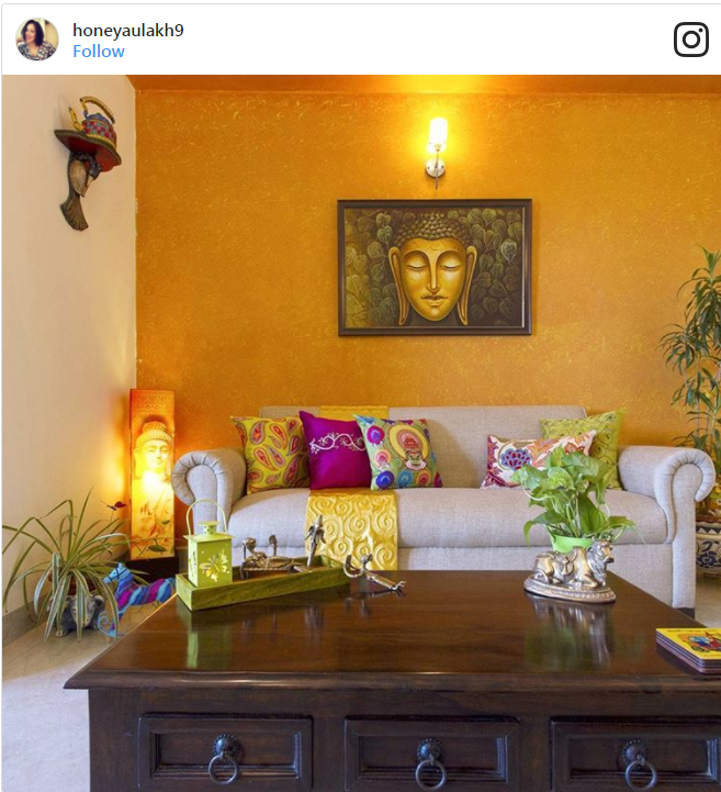
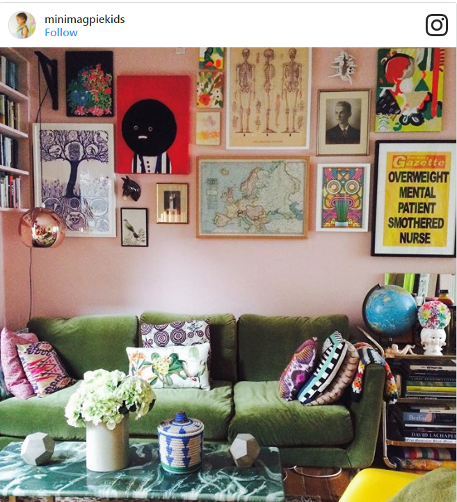
7 Colourful Eclectic
8 Dark and Dramatic

9 Grey Days

10 Bold Gold
11 Cobalt and Lilac
12 White and Gold Marble

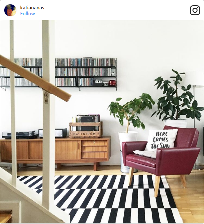
13 Midcentury Music Fans
14 Salvaged Chic
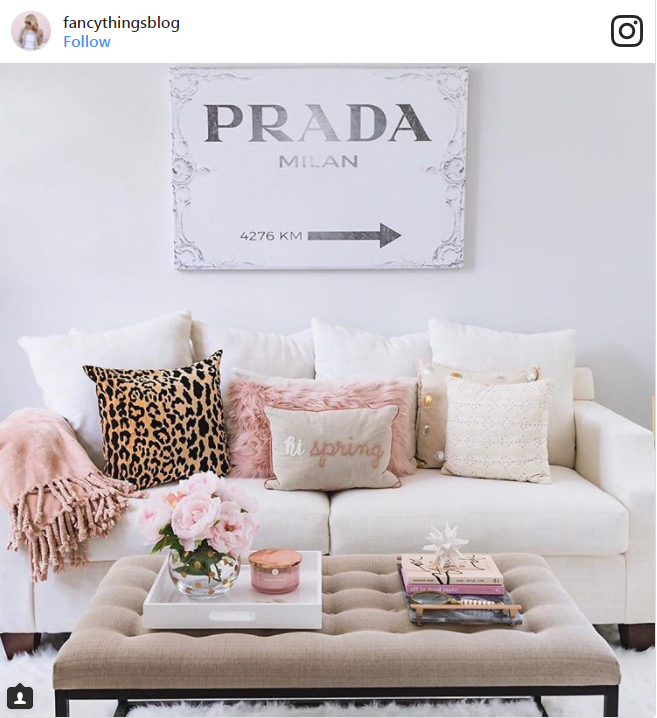
15 Pastel Pink Perfection
16 Upscale Pastels

17 Classic Linen

18 Retro Revival

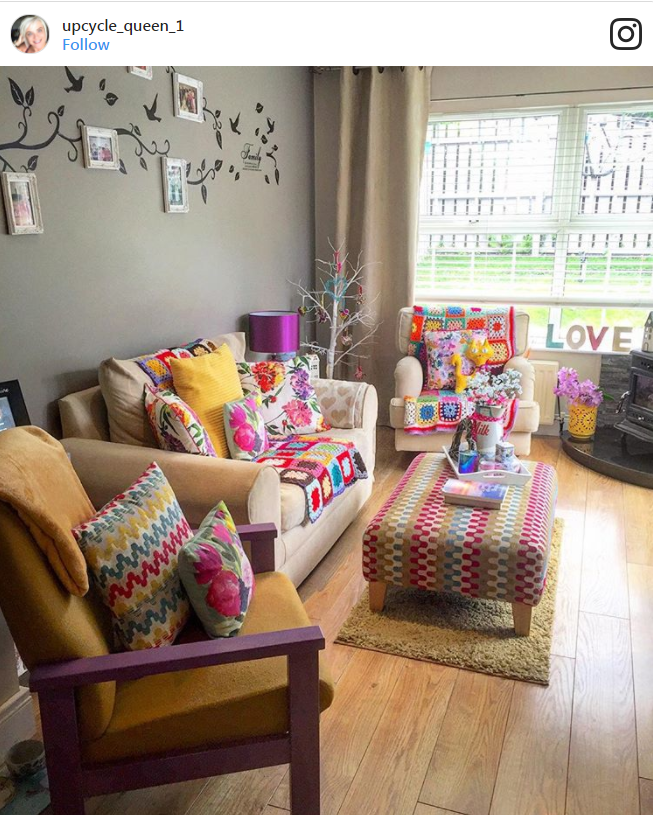
19 Colourful Crafts
20 Ladder Shelves and Houseplants
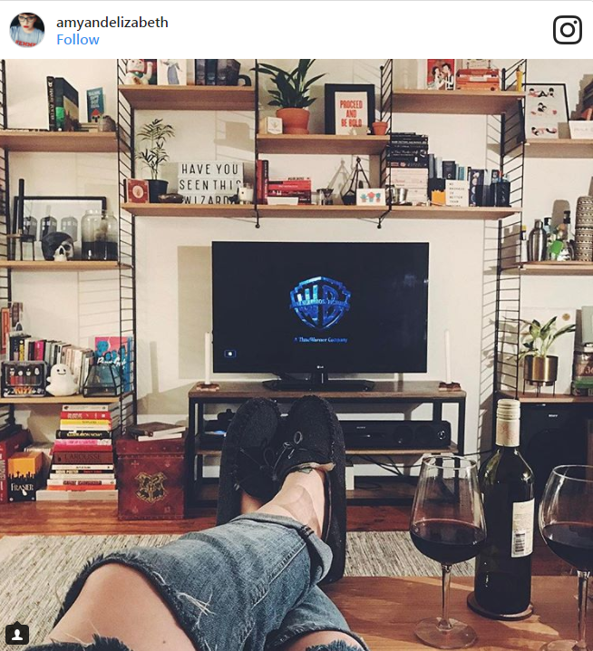
21 Statement Furniture

22 Fashionista Greys

23 Pink, White, and Cosy

24 ’60s Orange

25 Blue-Grey and Bold

26 Pastel Sofa and Statement Rug

27 Shades of Beige and Brown
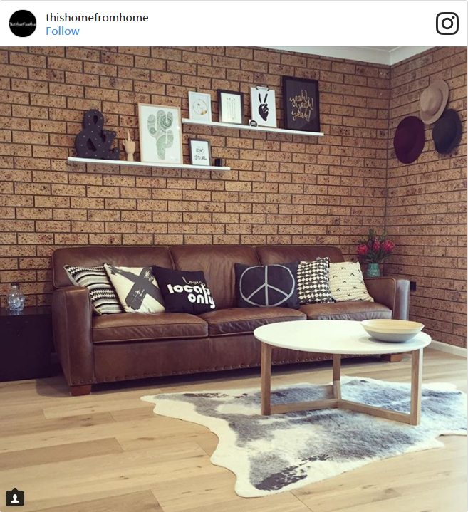
28 Let the Light In
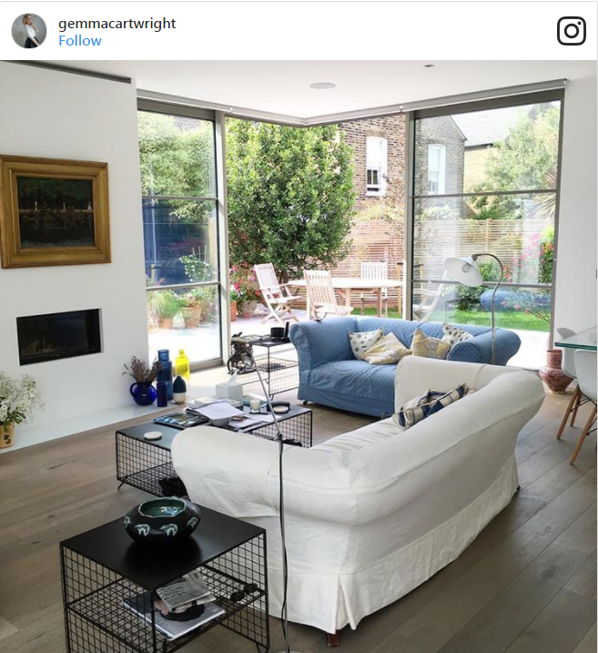
29 Retro Woods and Pops of Colour

30 Greyscale Chic
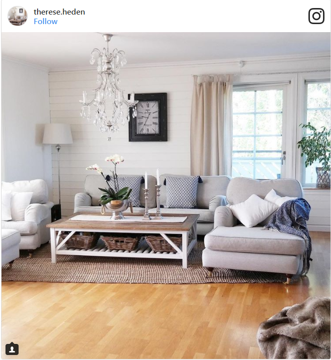
31 Cosy Cream

32 Pops of Pink
33 Textured Layers

34 Bringing the Outside In

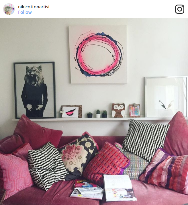
35 Bowie and Velvet

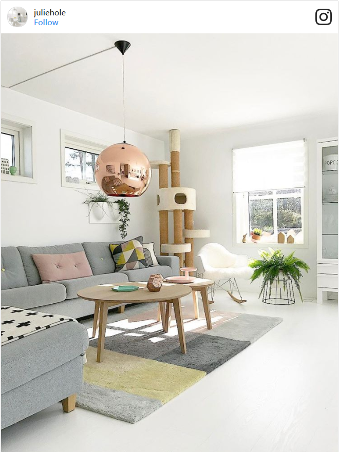
36 Grey and Copper (and Cats!)
Comments (0)